Meals on Wheels Form

Visual Design | User Experience

A revisuilzation of a sign-up form for Meals on Wheels


Recap


A project done in Q1 of 2023 for a master's class to solve for a scenario using principles and patterns learned in the teachings.


Deliverables
High Fidelity Mockup
Annotations

Role
Solo Visual Designer

Programs Used
Figma

Project Length
2 Weeks


1. Define

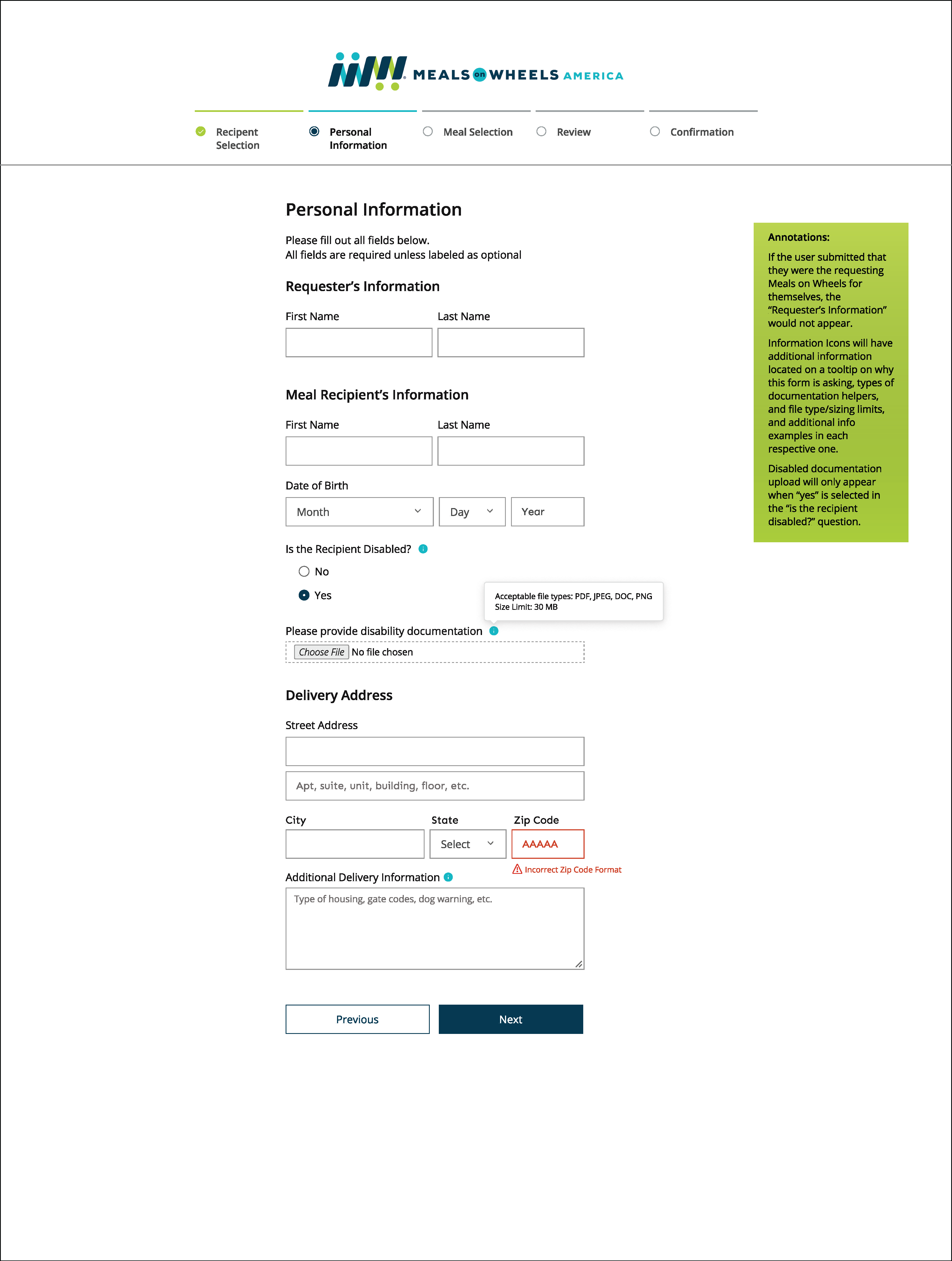
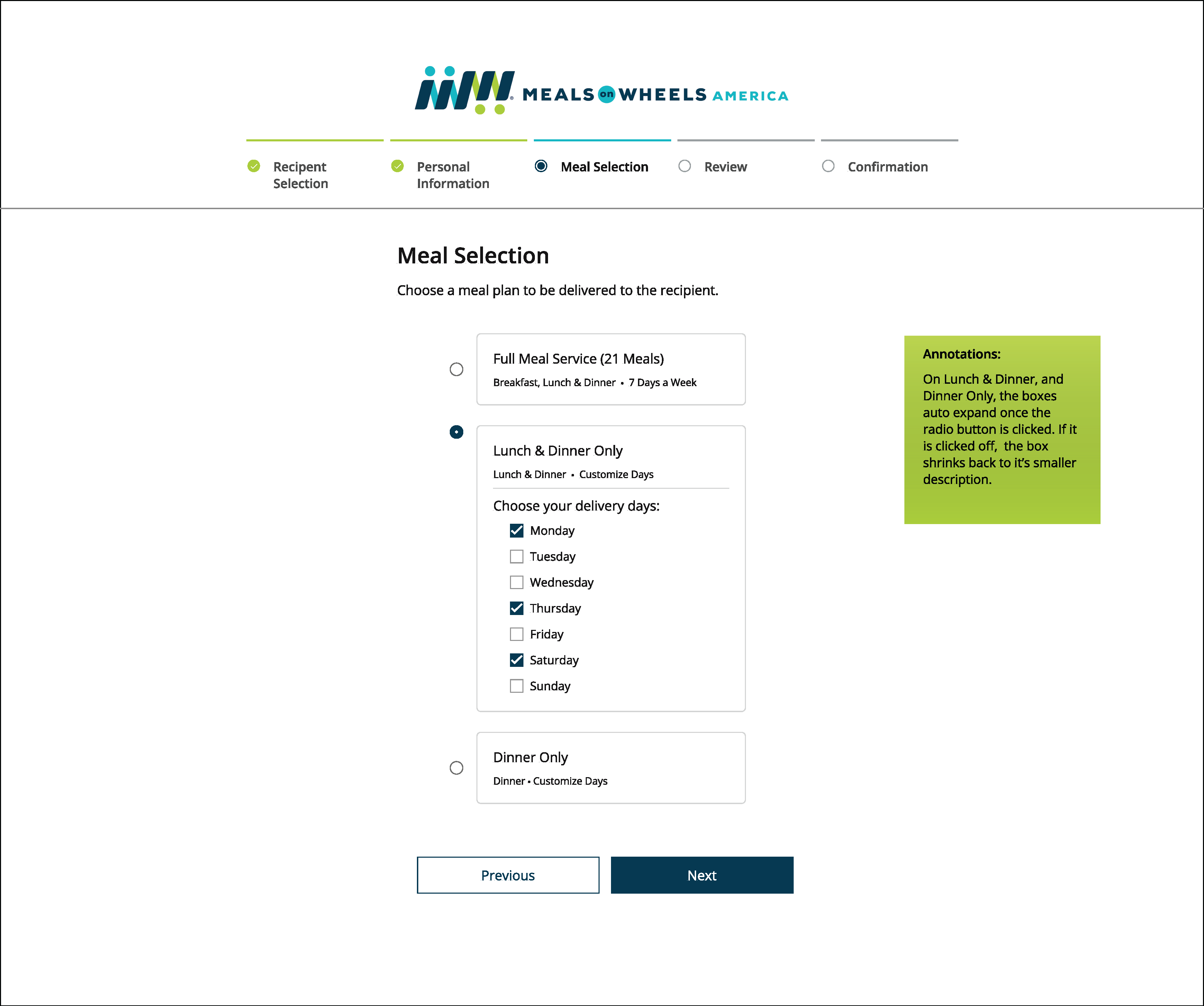
Given specific requirements on what information needed to be captured, it was the designers choice on organize the form to best fit the needs of a user:

  • Functional and well organized
  • Clear content heirachy and patterns
  • Annotations to explain functionality and organization

2. Research


Conducting research for this project was mostly the task of exploring the internet for pre-existing forms and noting what their expeiences worked and did not work. There was user feedback provided by fellow classmates after the first attempt to iterate for the final submission.


3. Ideation


Using the user research notes, I decided to land on that I wanted to do a multi-page form with each relevant section on each new page. That way, the user can focus on each section one at a time as well as not looking as daunting as a one page, long format form would. I also knew that I wanted to label each of the pages/sections so that the user can pre-plan and go into the form with an idea of what information they might need or to think about prior to starting the form.


4. Design


Logo

The Meals on Wheels logo was already establishes, thus was used for this mockup.

Color

The color palette was taken from the logo, and so a Navy was used as the primary. Teal Blue and Green were used as secondary colors for things like icons and decorative elements. Red was chosen to highlight any error states and grey was chosen for inactive elements.

Typography

A rounded, easy to read, easy to enhance typeface family "Open Sans" was selected. The rounded san-serif was to compliment the Meals on Wheels America typeface used in the logo. This typeface has many different font weights built in and also has worldwide character options for any translation needs via the browser.

Accessibility

With this form and the Meals on Wheels program being catered to the aging and disabled, having accessible elements was a focus in this process. The colors of the text was the darkest color of the color palette, Navy, for the best contrast ratio. Buttons were labeled and also colored in the navy color. Each of the links were underlined and a different color to showcase their purpose and interaction.


5. Reflection


There are still a few elements and annotations I would have added after the submission of this project. For example, I would have added that the ability to zoom on this page would result in a organized layout, and easier for those to see if they need a larger font on their device. I would also make the form wider on desktop, it feels a little cramped and there's almost too much white space on the sides of the form. A fixed with would make the transition of the pages look more inline. lastly, in the "Form Review" page, I would highlight and separate out "Recipient Selection" to be editable, since hitting "edit" would take it back to personal information.