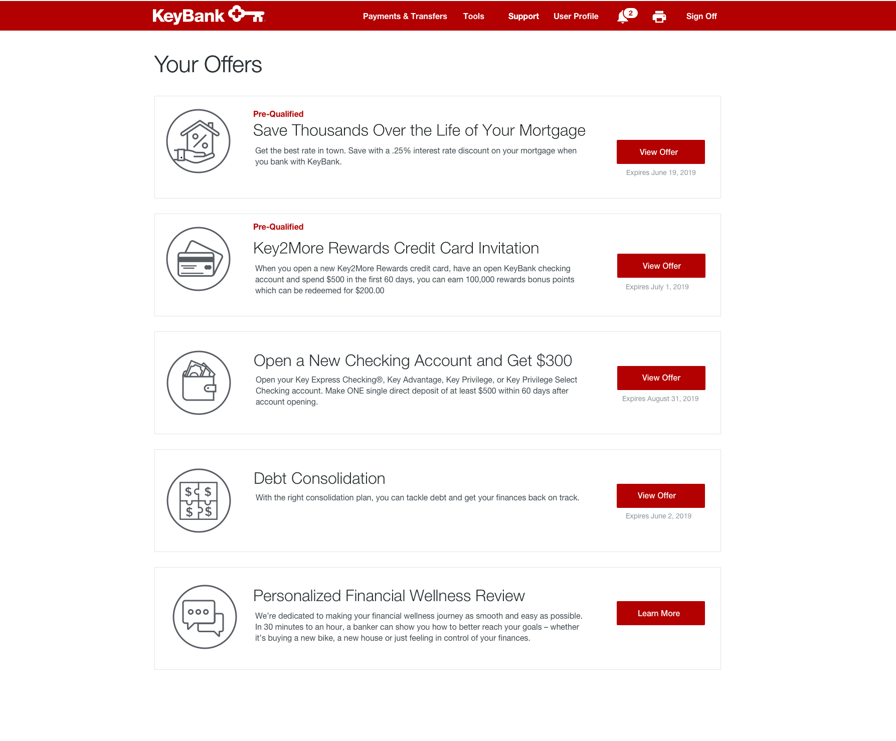
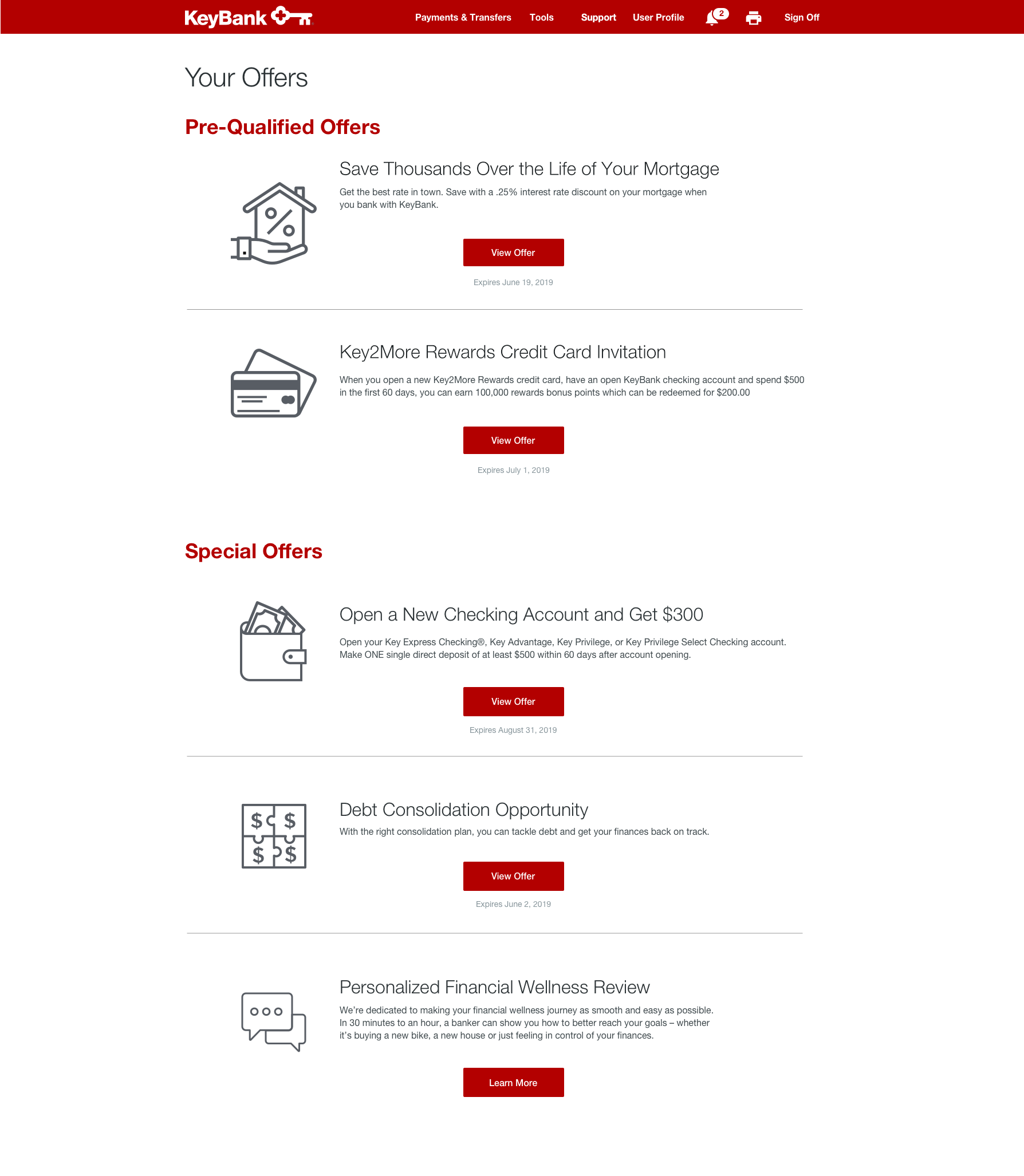
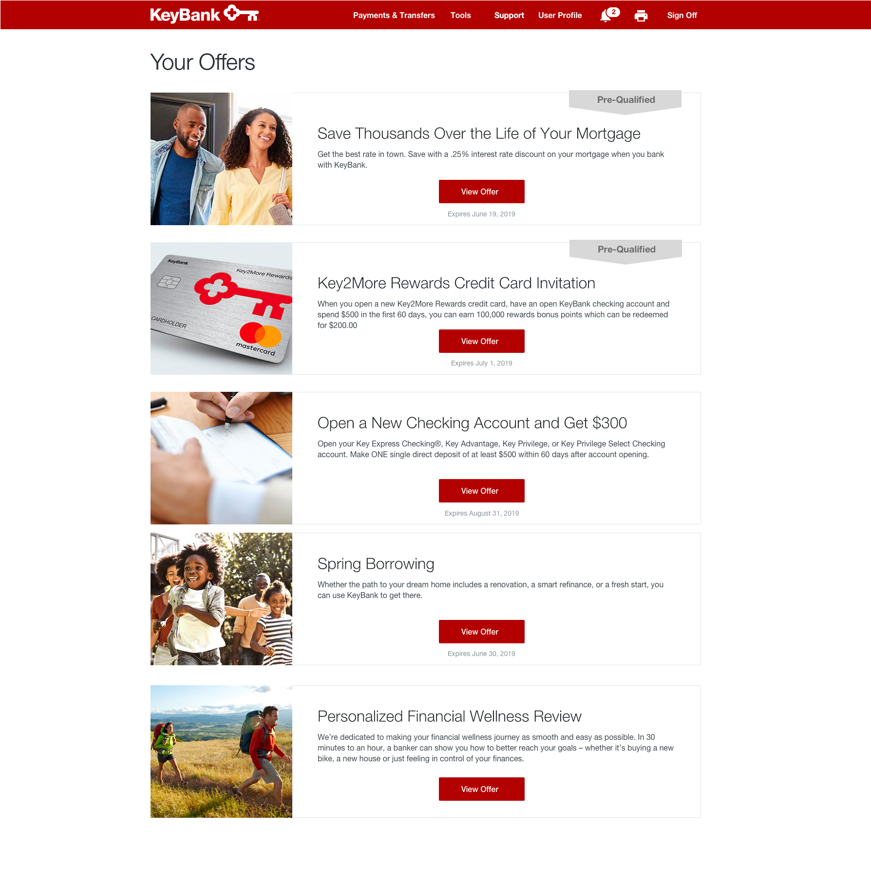
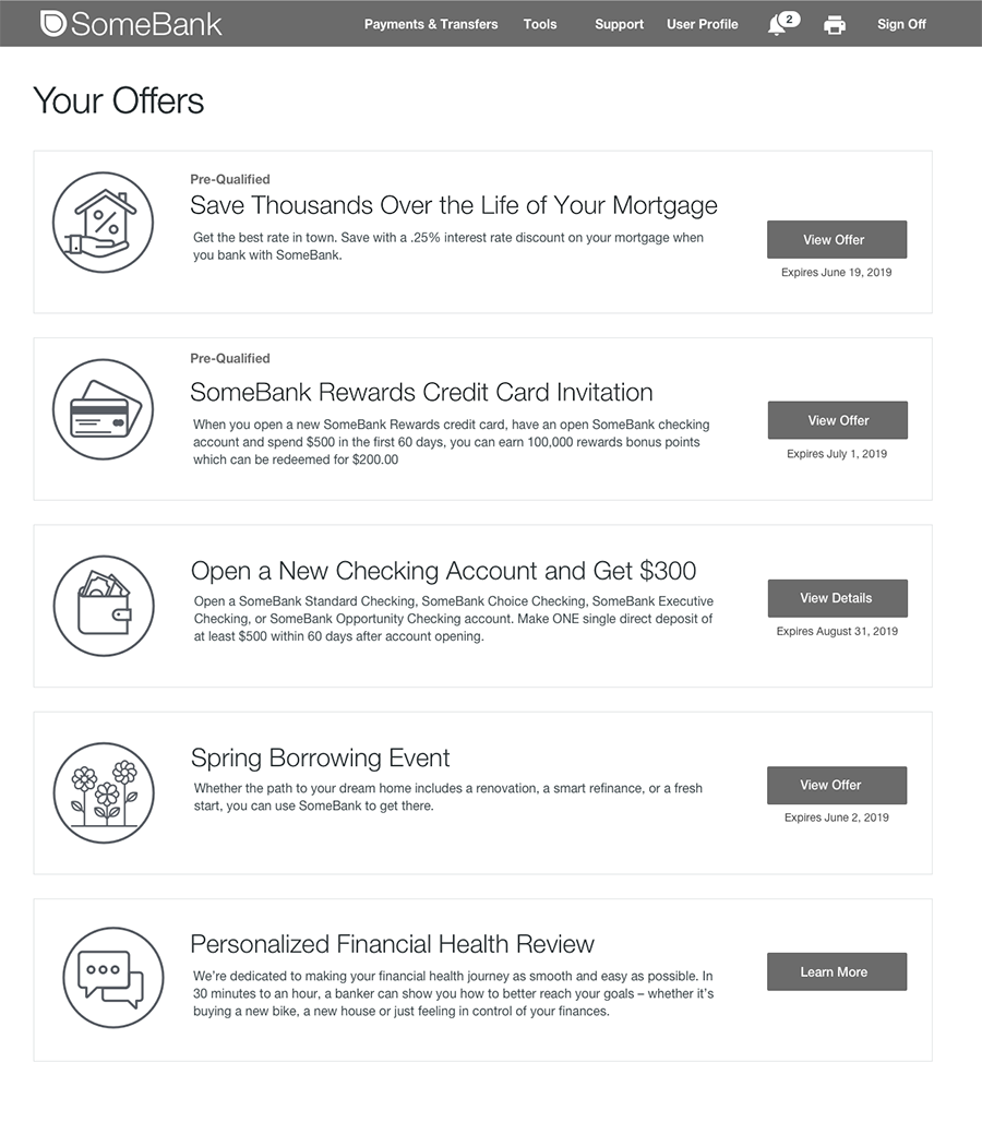
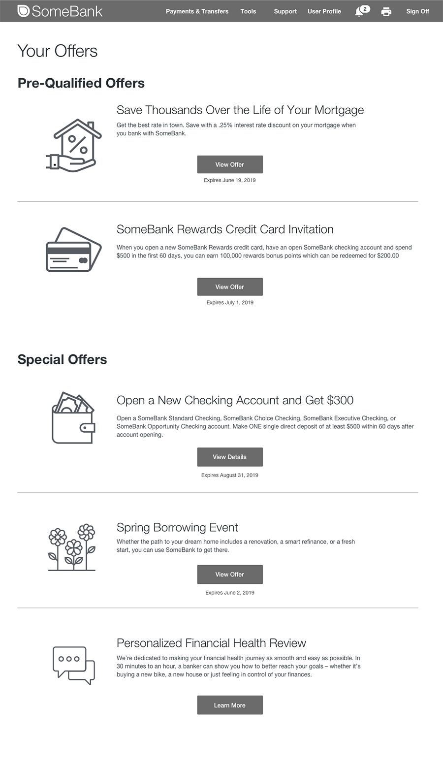
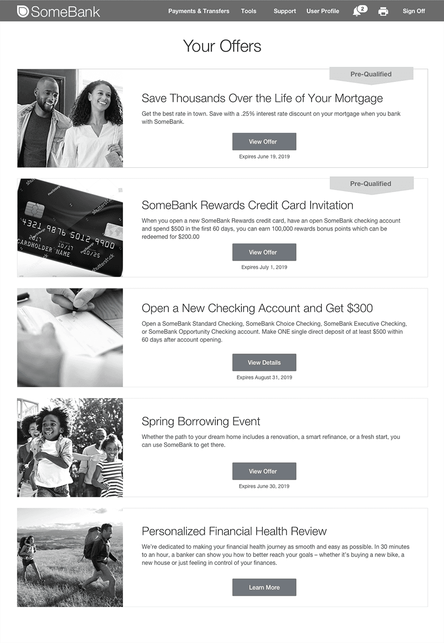
Client facing page for banking customers to advertise special offers KeyBank was promoting
Recap
Done in Q2/Q3 of 2019, the offers landing page made it easy for banking clients to find out special promotions or experiences that the bank offers. This page would be found within the online banking platform navigation header. Design and extensive user testing were completed for this project. Due to roadmap changes, this project was shelved indefinitely.
Deliverables High Fidelity Mockup User Research Results
Role Solo Designer Mentored by UX Research Team
Programs Used Sketch UserZoom
Project Length 4 Weeks
1. Define
One of the main goals during this time period was to increase sales within online banking. After some brainstorming and competitor analysis the idea of showcasing special offers and promotional items that are ran by the marketing department. We worked closely with the marketing department on the beginning of this project, looking to see if we could leverage marketing automation to help show the best offers to users based on their situation.
Objective
The purpose of this project was to help increase sales to hit goals for 2020. There were no ways to view current offers from a self-serve digital platform.
The research for this project were to solve for:
Findability
Reduce Risk & Improve Usability
Compare Performance
Measure Trustworthiness
2. Ideation
I wanted to make sure that users were not confused by what they saw if they entered this page, made sure that they were not overwhelmed by the content on this page, and most importantly, they didn't see this page as just a bunch of advertisements.
3. Design
Design inspiration came from the already established Key Design System and was used to help maintain brand integrity. At the time of design, KeyBank was using photographic images in marketing campaigns, while the online product relied heavily on icons and illustrations. Because this page was a combination of the two, being able to test out which imagery style related better to consumers seemed like a top goal when thinking about research opportunities.
4. Testing
Hypothesis
"The third layout will generate the highest amount of positive results due to its uses of trustworthy imagery, definded modular layout and clear, visible labeling."
Methods
All testing was done through UserZoom.com
5 second test
Word Cloud
Usability Test
Likert Scale/SUPR-Q Questions
NPS Score/Recommendation Questions
Conduct
50 people were surveyed for the 5 second test and SUPR-Q questions. 6 were chosen for a think-aloud usability study.
Participants were screened as followed:
Using Online Banking within the past week
Between the ages of 18-65
5 Second Test : 150 users were shown a design then asked to describe the page. A word cloud was formed from their answers.
Likert Scale/SUPR-Q: Users were shown the design and asked to rate it 1-7 using the provided adjectives. Negative Adjectives = 1, Positive Adjectives = 7. Adjectives were very similar to those found in a SUPR-Q questionnaire.
Usability Test / Unmoderated Video Think-aloud: Users were given specific tasks on how to find certain pieces information like expiration dates and if they are pre-qualified. They would talk through finding the information in a recorded.
Offers Page - Layout 1
Offers Page - Layout 2
Offers Page - Layout 3
Analysis
After analyzing the responses, the results confirmed the hypothesis that layout 3 was the clear winner. Findings found that it was the highest rated in being trustworthy, a recommendation vs and advertisement and clear.
The usability portion determined that there were some issues with the expiration date of the offers, in which people could not find them. Others had trouble with the "pre-qualified" banner and what it meant.
5. Reflection
With the layout 3 being the clear winner, it was presented as the final layout style. Design elements from Key Design System were incoperated and the page was cleaned up and content was entered. Unforunately, the offers page was never able to be placed into development due to prioritization. However, I was able to present the offers page project with strong emphasis on the research and design thinking portion to a group of candidates for an experimental recruitment day in July 2019.