Key.com Help Chat Redesign

Visual Design | User Experience | Coding

The Key.com Chat box redesign was started and finished in Q4 2018 to Q1 of 2019.


Deliverables
High Fidelity Mockup
Code

Role
Solo Visual Designer
Junior Front-End Developer

Programs Used
Sketch
Sublime Text
Github

Project Length
3 Weeks


1. The Problem

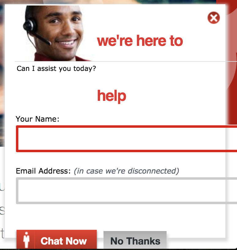
As you can see from the picture, the original chat box that was on the Key.com site, which would show when you were looking around the site, was quite a mess. The title of the chat box was on two different lines. The stock image was artificial and mundane. The text boxes for Name and Email, buttons and divider line are all hanging off the inside frame. There's a glow along the edge that is very outdated. Overall, it really needed a new design.


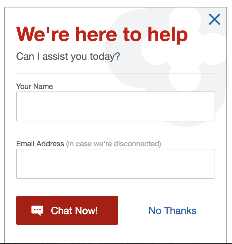
Surprisingly, the HTML of the page couldn't be edited due to technology constrants. Only the CSS. So it was a bit more of a challenge to design the new chat with the hard-coded features of the old.

2. The Fix


The redesigned chat box is working off of the Key Design System that is used within Enterprise Digital, aligning the look and feel including the colors, iconography, typography, buttons and spacing. It feels much more "Key" branded. There's the clover in the background, which is found within areas in online banking and originations applications.


This chat box was coded by me, with some guidance and review from my manager on the project. It was eventually pushed to the live site after some testing. The verdict is still out on how it has improved the usability in numbers, but I'm confident that those who use it will find it easier than it's original.