Dumpsters.com Blog
Visual Design | User Experience
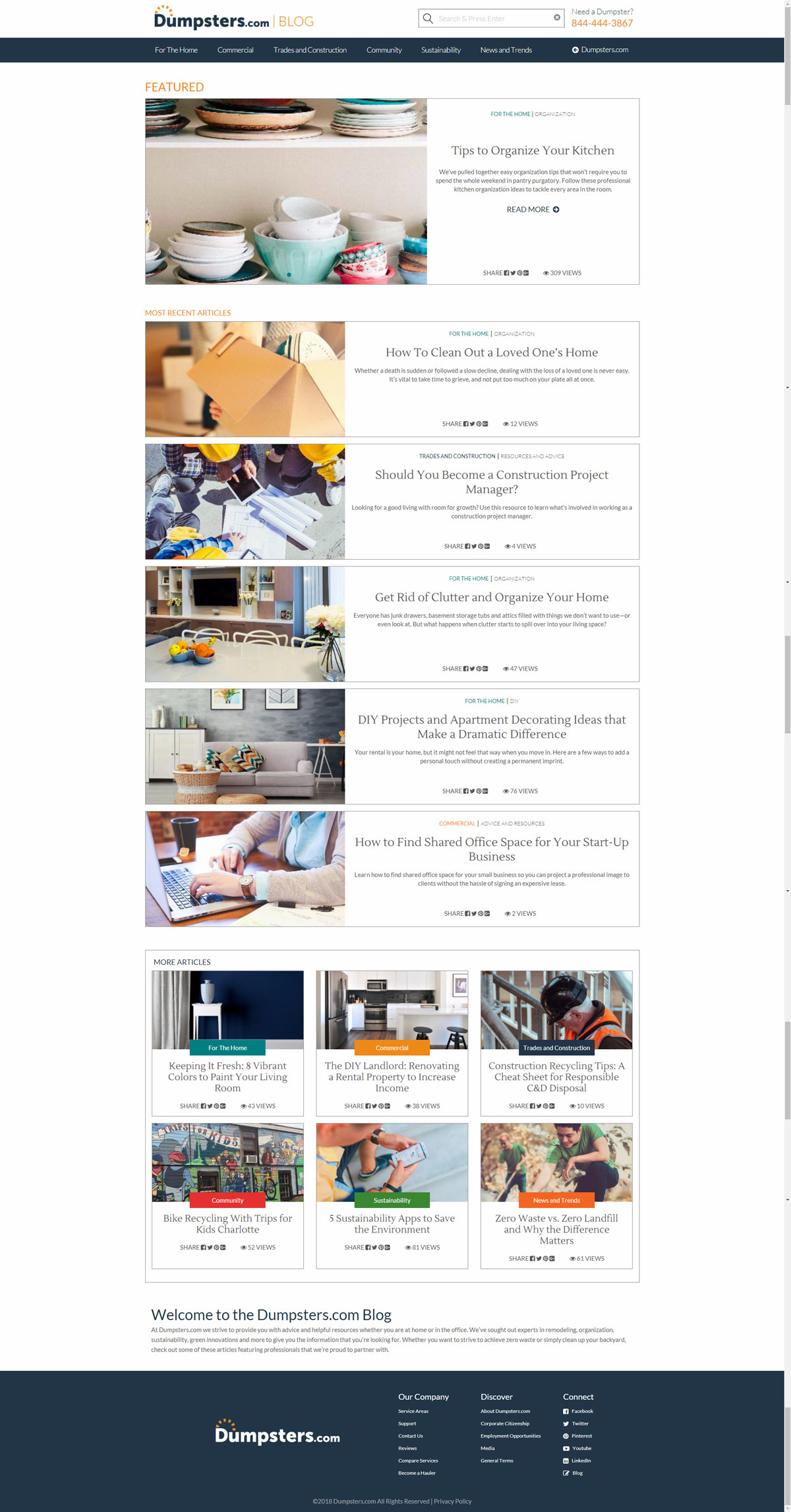
Launched in spring of 2017, this blog was created from scratch and coded on a custom CMS, allowing a lot of creative freedom for this project. New articles are published every week from the content team. The main purpose of the blog is mainly for name recognition, and the potential for new customers if inspired by any of the articles within the blog. Article themes range from waste industry news to DIY projects around the house.
Design
When Dumpsters.com first launched, the blog was the next section of the site that was planned. The blog on BudgetDumpster.com had been successful in terms of marketing and name recognition, so there was no doubt that Dumpsters.com would follow. Our audience and message published would be pretty much the same, so thanks to the BD blog, we were able to look at data to see what design elements of that blog were successful and what were not.
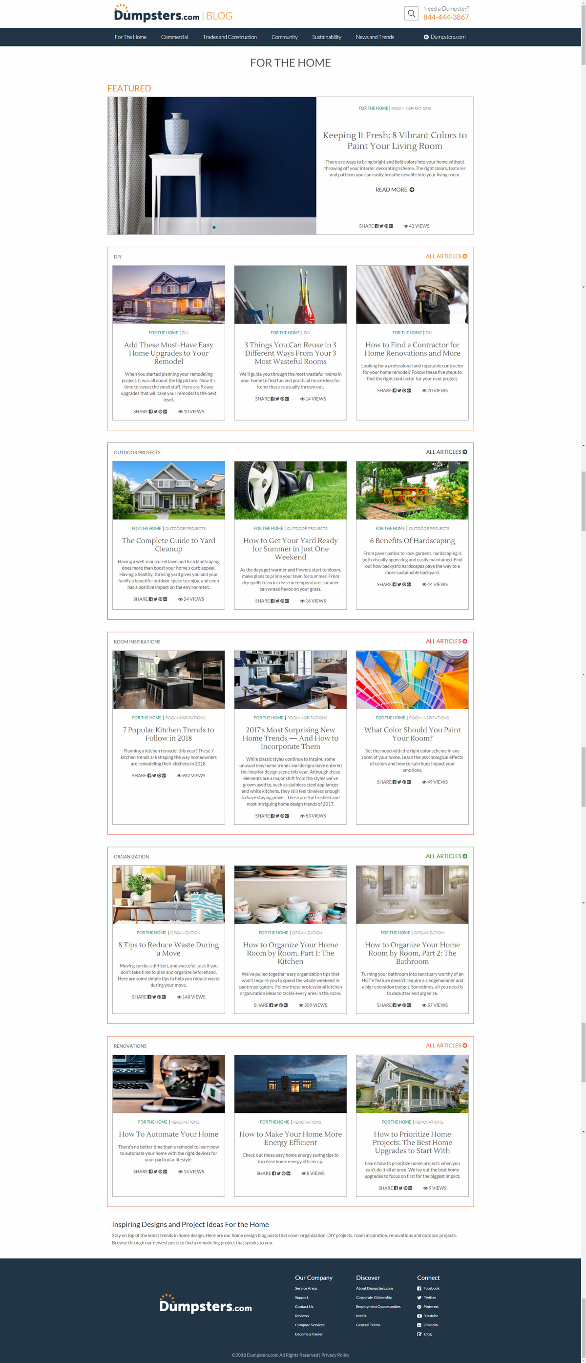
At the time of the initial sketching, tile layouts and card style design were very much in trend. I personally am a fan of the card layouts, due to how modular and organized they can be when implemented correctly. The brand leads and content behind the Dumpsters.com blog had quite a large listing of categories and sub-categories, with 6 and 17 respectfully. Due to those, organization was the number one priority when designing this was making sure the user can find exactly what they want without getting lost. Subtle color coding was added for each section and sub category. These colors were actually inspired by Dumpster.com logo prototypes that never made it past the drawing room.
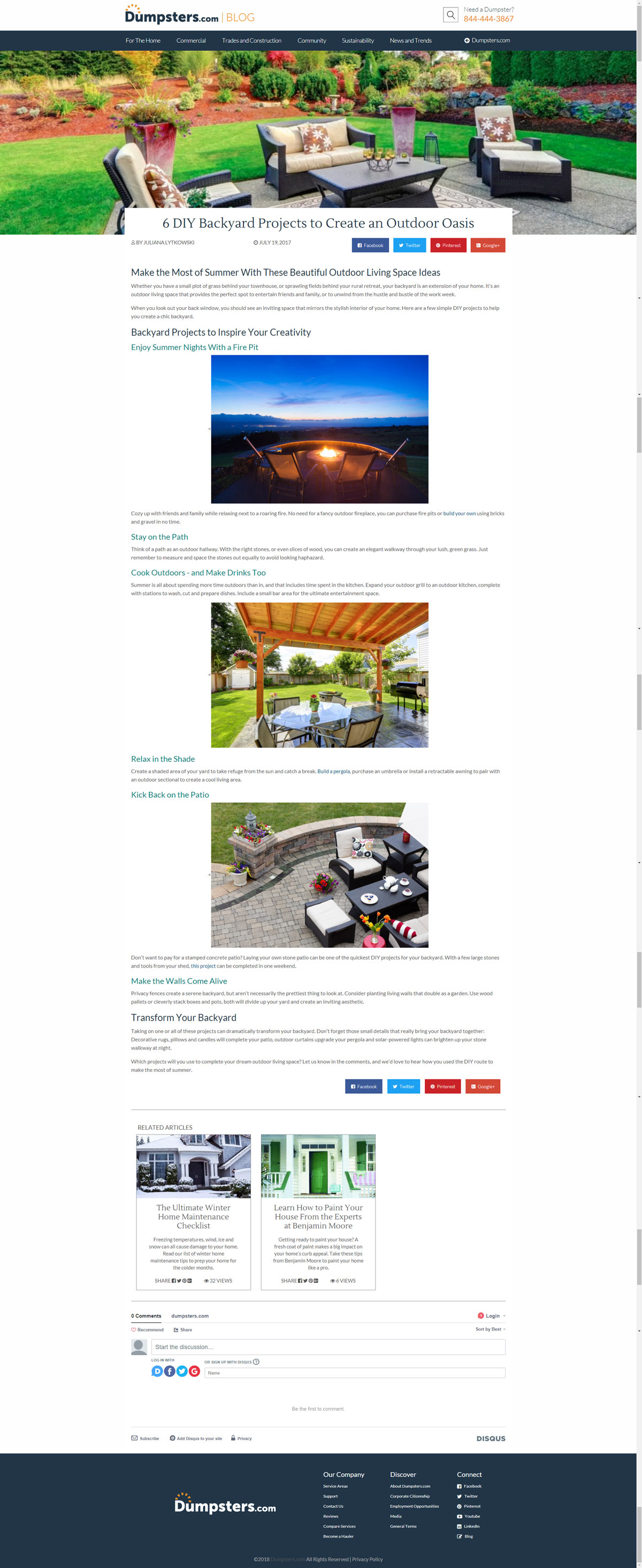
I researched a few popular blogs at the time including competitors, news websites, technology or design based blogs and DIY type blogs to see what elements were working for them and what wasn't. One particular design element that I implemented was the "article views" in place of "comments". Of course, most blogs often advertise how many people have engaged with the article however what we learned from the BD blog were that a large amount of people were viewing the article, but not commenting on it. Instead of the sad "0 comments" front and center, it was changed to how many have viewed it. This is one example of learning from our previous data and using it to make a positive change. Overall, the launch of the blog has been a success and continues to stand strong today.